
Spring Colours 2015
 |
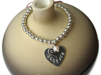
| Image courtesy of Rena Klingenberg |
Here are the Pantone colours for spring, you'll notice most of the fashion industry will be following the trend and using these colours in their designs. Pantone pretty much chooses the shades for everyone each season when they publish their colour fashion report.
"This season, cooler and softer color choices with subtle warm tones follow a minimalistic en plein air theme, taking a cue from nature." -- Pantone
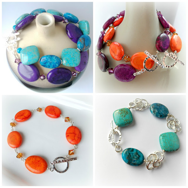
I love the blues included this time, there weren't any turquoise esque hues suggested last year but of course I still used lots of turquoise stones in my designs anyway. My favourites here are the Lucite Green, Strawberry Ice, Classic Blue, and Scuba Blue; all me colours!
I can think of a few pieces of jewellery that go nicely with these already and I have plenty new designs in some of these colours ready to go onto the website. Watch this space! Lots of exciting new earrings coming. Earrings, my one true weakness.
 |
| Dusk blue, Glacier grey, Tree top, Classic blue, Toasted almond, Woodbine, Sandstone, Titanium, Marsala, Lavenda herb |
Let me know what you think of the colours for this spring summer.
Natasha x
Natasha Fraser Handcrafted Jewellery
www.natashafraser.com
Reference: Pantone Fashion Report Spring 2015


Comments
Post a Comment